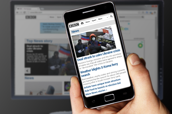
There's a lot of talk out there about mobile websites, most of it justified. Mobile devices have doubled their share of all web browsing traffic between March 2012 and February 2014, from 7.2% to 16.4%, according to NetMarketshare. Moreover, new device sales are trending strongly towards the tablet and smartphone, both domestically and across global markets.
With this trend in mind, it is critical to design sites to be ready for mobile devices now rather than try to retrofit them later. Responsive web design (RWD) is both a philosophy and set of techniques that support the development of websites that "respond" - in layout, content, functionality, and overall look-and-feel - to the device used to view them. Responsive design is not just a layer of prettiness slathered onto content. When we try to apply RWD to an existing site, more often than not we wind up tearing the whole edifice down and rebuilding from scratch. (We could say more about responsiveness, but will leave that for another blog.)
Three Critical Questions to Determine Whether You Need a Mobile Website
1. Is your site worth a quality mobile experience?
In other words, what do your users do on your site and is it important enough to allow them to do these things in an optimized way on their smartphones and tablet computers? If you value your organization’s mission or believe in reaching the growing mobile audience, the answer should be a resounding "YES!"
There are fewer and fewer web-based activities that are not undertaken on mobile devices now. Users regularly send and receive email, manage their social media profiles, find information, buy products and services, conduct video conferences, watch cat videos, and basically everything else you can think of on their mobile devices. There are only a few activities that are still solely in the desktop/laptop world: high-end gaming, programming, and media editing are the only ones we could think of, and none of them are typically facilitated by a web interface.
Basically, if your website matters, it matters enough to make it mobile!
2. Are your users on mobile devices now?
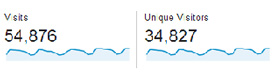
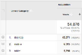
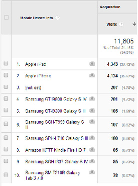
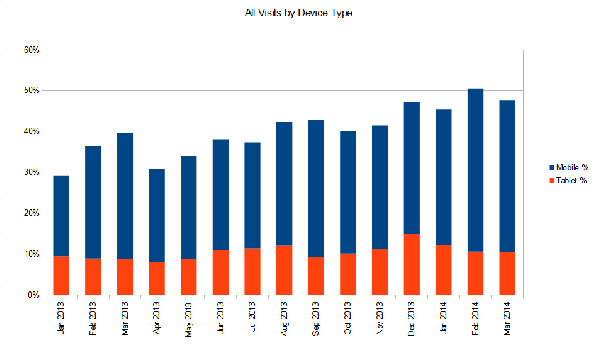
Google Analytics is one of our favorite free tools for so many reasons. One of the recent upgrades to the tool captures users’ mobile device information down to the make and model. You can compare the number of "mobile" visits, a.k.a. tablet and smartphone, against the total visits for a given time period and determine what percentage of your users are mobile. It might surprise you! Below are last month’s analytics from one of our clients. The website receives over 54,000 visits per month. Over 11,000 or 21% of these visits are from mobile devices. Most of our sites receive between 10-25% mobile traffic.
Another client of ours is a property management company whose site serves three local shopping centers. We were surprised to see how mobile and tablet devices had grown from 30% to 50% of all user visits between January 2013 and February 2014, with mobile users accounting for almost all of the growth.
When a significant fraction of your user base is on mobile already, it’s a no-brainer to deliver an optimized mobile experience.
3. Do your users require on-the-go access to your site?
Depending on your business or organizational model, it may be critically important that users be able to perform certain tasks on your website in an optimized way. Think of Fandango: the desktop version of the site is geared towards billboarding top movies, showing video clips, and otherwise delivering quality content to movie fans.
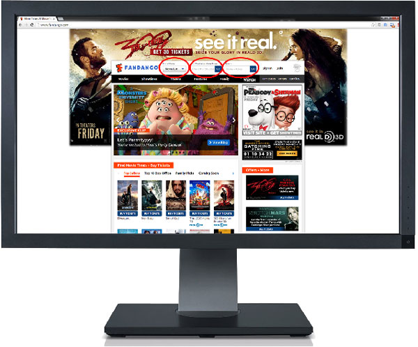
The more functional aspects of the site are at the top of the page next to the logo: Find a Movie, Find Theaters & Movie Times, and Search. On a large desktop or laptop display, this is perfectly acceptable. The objective of Fandango’s desktop site is to immerse and excite the user, with the ability to find and reserve movie tickets being secondary.
The design makes good use of a widescreen HD monitor’s real estate without burying the functionality. If Fandango had carried this philosophy through to the mobile version of its site, it would have been a muddled mess: text is too small to read, the trailer images are too small to identify, links are too close together to click accurately, and the user is forced to zoom and pan around hunting for desired functionality… if the user doesn’t immediately close the browser in dismay.
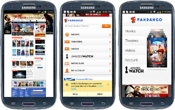
In its mobile site, Fandango chose to bury the movie trailers and other content in secondary pages while emphasizing the search and ticket reservation. They also made use of GPS location to deliver search results geographically relevant to the user.
The next step up is its dedicated mobile app, a program specifically built for the Android, iOS, or Windows Mobile operating system to deliver an even cleaner, quicker experience to users that isn’t dependent on the network connection speed. Aside from the app’s splash page, it’s largely identical to the mobile version of the website.
The bottom line is that the vast majority of our prospective clients could benefit from having a mobile-responsive site. Remember those three questions: Is your site worth it? Are you getting mobile traffic already? And do your users require on-the-go access?
Category: Web & Technology
Tags: websites